Where like-minded travelers can discover, save & post travel recommendations
Overviewthe basics
what
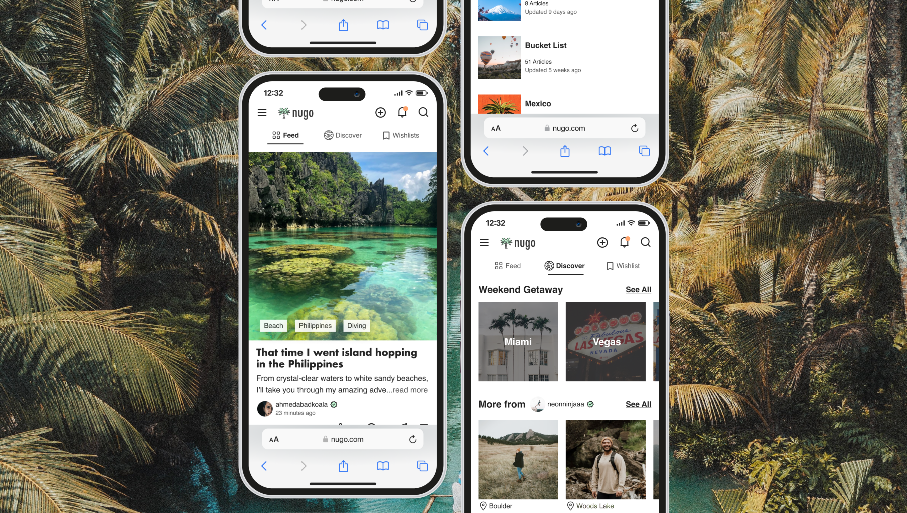
nugo is a mobile-first social media site that streamlines travel planning so travelers can prepare for their adventures with ease
who
I completed the end-to-end design process as part of a student project
when
September 2022 - January 2023
Initial Problem Investigatedhow nugo started
As a traveler, I’ve seen a growing trend of solo travel on social media. Even though solo travel is often hyped up, travelers often perceive risks in traveling alone that greatly impact their travel plans.
In order to understand whether safety risks actually affects a large number of travelers, I conducted a discovery online poll and found that, out of 62 respondents, 94% reported worrying about safety when traveling alone.
While some social media and blog posts identify solo travel tips, there aren’t many popular platforms that address solo traveler needs in planning their next adventure.
Assumptions & Goalswhat I set out to accomplish
initial assumptions
Travelers want to go solo
Social media influences travelers
Travelers face safety concerns
Those concerns are gender-based
Travelers like to meet others while traveling
high level goals
Discover traveler concerns
Understand the impact of concerns on travel plans
Determine what travelers do to mitigate concerns
Processbut first, understanding the user
methodologies useddigging into the problem
secondary research
I read travel blogs and websites to understand what is being said in popular travel communities.
competitive research
I explored travel platforms and apps such as Couchsurfing, Airbnb, TripAdvisor, Facebook in order to understand the competitive landscape and services currently offered to travelers.
user research
I interviewed participants to gather their point-of-view. Out of the 8 travelers between the ages of 27-36 that were interviewed:
2 currently travel solo
4 formerly traveled solo and now prefer to travel with a companion
2 have never traveled solo and prefer to travel with a companion
user Interview outcomessome key themes emerged from affinity mapping
participants face travel-related fears
88% fear empty streets at night
75% fear being targeted because of identity
75% fear being physically assaulted
participants take safety precautions
88% feel most safe when they are with someone else
75% need to have a plan in place
63% try to find safe areas to stay at and visit
participants rely heavily on recommendations, from a variety of sources
88% use Instagram and TikTok
75% use a Google search for information
75% rely on bloggers they identify with
63% use Youtube
participants travel for many reasons
88% focused on doing activities
75% focused on experiencing culture
75% focused on trying new foods
Revisited Assumptions & key insightswhat I quickly realized
assumptions - revisited
✖️ Travelers want to go solo
Surprisingly, only 33% of participants still wish to travel solo
✔️ Social media influences travelers
✔️ Travelers face safety concerns
✖️ Those concerns are gender-based
All participants expressed travel concerns - regardless of gender
✖️ Travelers like to meet others while traveling
Only 38% of participants prioritized meeting people during their trips
deeper insights
Instead of solo travel, participants focus on traveling with a partner & planning their trips in order to feel secure.
Planning methods were often varied and not streamlined, resulting in travelers losing track of recommendations.
Processidentifying actual user needs
User personasmeet Carson
Based on research and insights, 3 personas emerged and I was able to prioritize Carson as the one that represents most users. I planned on supporting Angelica and Juan in later phases.
the Actual problemreframing the problem
point-of-view
Travelers need a way to discover and aggregate travel information in order to streamline the way they access and store recommendations from sources they identify with.
how might we...
help travelers discover and store travel information from sources they identify with in a more streamlined way so they can have a plan and feel empowered to explore new places?
Processbrainstorming solutions
ideationfinding ideas
divergent ideas
As ideating was pretty new to me, I tried different methods to help solve the user problem.
storyboarding
I then drew up two ideas that best fit Carson and narrowed it down to one.
Prioritizingearly stages of nugo
nugo emerged as a social media site for travelers looking to connect in order to discover, save, and share trusted travel recommendations.
In order to set up nugo for success, I listed out features and prioritized them in terms of must-haves & impact x effort.

Processbuilding a representation
Information architecture & user flowsnavigating nugo
card sorting & site mapping
As this was a new site, I conducted a card sorting exercise with 10 participants to better build out a user-friendly site map.
user & task flows
I also built 3 user and task flows to anticipate the user's journey and establish a design roadmap.
Wireframes& setting up a framework
Using the available user insights, I created low and mid fidelity wireframes to represent the solution and refine any unclear aspects before testing.
At first, I found it challenging to distinguish between developing a mobile-first website and an app and went through several iterations before finally nailing it down.
..while connecting the dots
To keep design decisions focused on Carson’s goals, needs, and motivations, I made sure to tie them back to my user interview findings.
building a trusting community for users
Users face travel-related fears and seek to find information from trusted sources. nugo:
Enables users to connect with like-minded people
Has an account verification system that displays checkmarks for users that have undergone the verification process
helping users prepare for their travels
Users feel most secure when they have a plan in place. nugo:
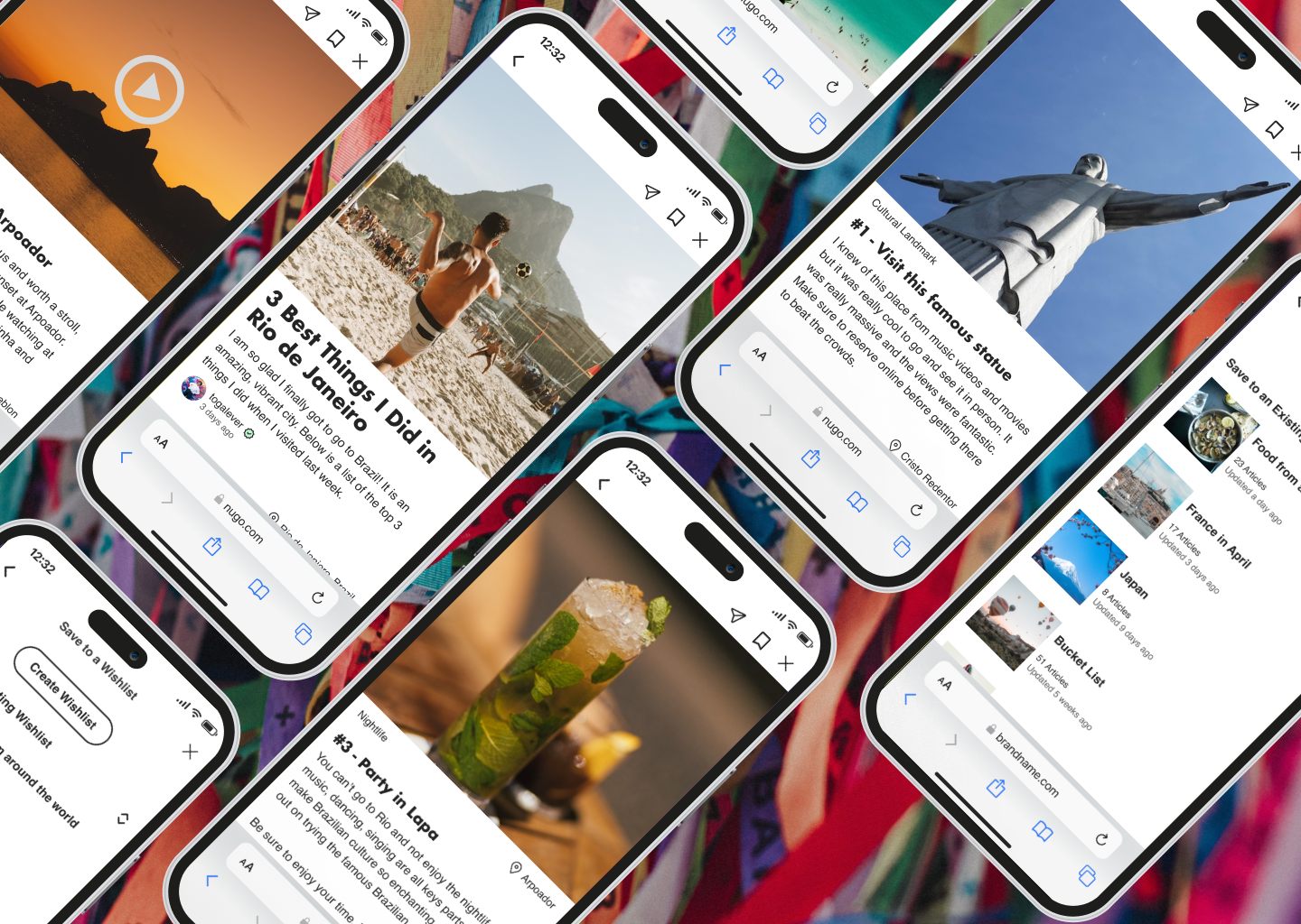
Allows users to save recommendations they find into sortable, shareable lists.
creating a space where users can find and post travel recommendations
Users rely heavily on travel recommendations. nugo:
Has a feed feature where users can view travel suggestions from those they follow
Has a discover feature where they can discover other travelers to follow
Allows users to contribute to and share with their travel community by posting their own recommendations.
delighting users with the ability to discover things to do and places to explore
Users travel for a variety of reasons, with a heavy emphasis on discovery. nugo:
Links users to personalized travel lists and recommendations generated by an algorithm that is fine-tuned according to their activity.
Component Libraryadding some style
A component library then emerged based on core brand values: exploration, diversity, connection
Hi-fi Frames & Prototypingbringing nugo to life
After adding all of the branding to the wireframes, they were ready to be tested with participants to ensure usability.

Processtesting it out
Testingseeing what users think
nugo was tested with 5 participants ages 25-39. Participants were instructed to undergo 3 task flows:
task 1: Searching for a Location
task 2: Saving a Post into a New List
task 3: Posting a Recommendation
Feedback was collected on Time on Task, Error Rate, Completion Rate, and on items such as user satisfaction using a Likert scale.
Resultsoverall, participants really enjoyed nugo
They:
remarked on how nugo was easy to navigate, straightforward, and intuitive
liked that photos are the focal point & the pops of color
found the “discover” tab really useful & liked seeing recommendations listed by like-minded people
appreciated the clear success message after completing task 2
here’s what they had to say:
Results - continued& they completed tasks mostly as expected
task 1: searching for a location and retrieving a travel article
Completion: 100%
Time on Task Estimated: 21s : Average: 27s
Errors: 0
Main Usability Issue: No big issue
task 2: saving the travel article into their wishlist
Completion: 100%
Time on Task Estimated: 23s: Average: 22s
Errors: 0
Main Usability Issue: No big issue
task 3: posting an article with recommendations
Completion: 100%
Time on Task Estimated: 51s: Average: 103s (1min42s)
Errors: 2
Main Usability Issue: Participants found the steps confusing and perceived them as unintuitive
Iterationshowever, some things needed to change
In order to prioritize participant feedback and understand which iterations were needed, I used a severity x frequency matrix to identify the top usability issues and an impact x effort matrix to prioritize solutions in terms of feasibility for the MVP.
iteration needed: task flow 3 revisions - essential to the functioning of the MVP
Participants were confused about the steps and it felt unintuitive.
I redesigned flow 3 to start with article template that users can ‘fill in’ rather than starting with asking for location and a photo. Participants reported feeling more familiar with completing a template and thought it would be more intuitive.
I added some messaging/feedback regarding user actions to better guide them through the task & inspire confidence
iteration needed: home feed card revisions - essential to user experience
Participants expected to have the copy follow the image and to have a quicker read of what articles contain without having to click on it
I redesigned the card structure for the Home Feed after a quick study with 8 participants showed that 100% of them chose card option with image first and the post information below
I also added labels that jump out quicker so users know what the post contains before clicking on it in response to user feedback
iteration recommended: sort button revision - quick fix that can lessen user confusion
There was some confusion around what the sort button did and it is something that could be easily swapped out
I swapped the previous sort icon for a new one given some confusion around it. It was a quick fix that made a lot of sense to make.
Processdelivering the product
introducing: nugo

check out the prototype
TAKEAWAYS
some lessons learned
what i enjoyed
The way my participants surprised me and challenged me to dig deeper
Building a new product
Discovering the design process and understanding how it relates to areas that I have worked on before such as research & psychology
what i learned
The key differences between mobile-first and app design
The delicate balance between utilizing established design patterns and creating a unique, branded user experience
Working in an agile way can save a lot of time: pivoting and iterating often
The importance of following my gut and making quicker decisions
what was challenging
Although nugo naturally feels like an app, I had to work within the brief and technical constraints of creating a responsive website
While carrying out this project, I was also learning about the design process, tools to use, and how ask for feedback and iterate
Apart from receiving feedback from my mentor, I tackled the design of this project as a one-person team
what i’d do differently
I’d spent more time investigating the type of travel information that people expect from travel sources
I’d make sure to understand and follow the technical requirements from the beginning


