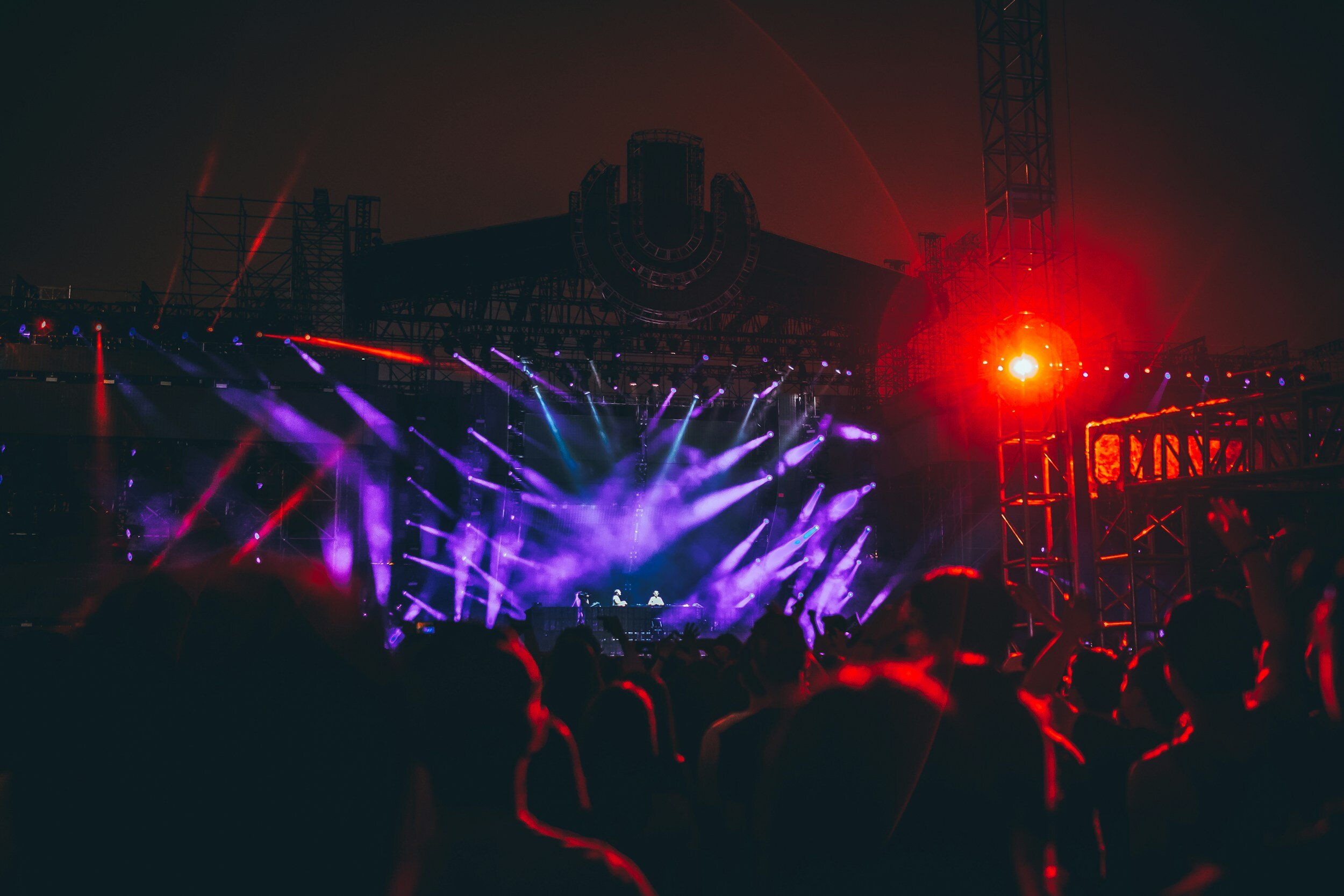
Revamping a music festival schedule for an optimal mobile-first experience
Overviewthe basics
what
Redesigned music festival website for optimal mobile usage, resulting in a 64.71% CSAT score
who
Anna Thorsteinsson - Marketing Manager
Dinamicka Development - Engineering
Hanna Silva - Product Designer
Krisztian Dutka - Design Mentor
when
May - June 2023
Problema change in the iceland airwaves music festival website raised usability and business concerns
In 2022, Iceland Airwaves, an annual music festival in Reykjavík, transitioned from a white label app to their own website to cut costs and improve content control, leading to usability and business challenges. In 2023, festival organizers prioritized addressing these issues to enhance the overall experience.
😕 Usability issues:
❌ Challenges navigating the overall festival schedule on mobile devices
❌ Difficulty saving specific shows to a personal schedule
💼 Business concerns:
❌ Potential confusion regarding festival tiers, resulting in underutilization of options
❌ Lack of space dedicated to showcasing official venue sponsors and event partners
Solutiona mobile-first music festival schedule that better highlights key information while allowing users to personalize & navigate on the go
stay updated on key festival details
easily search & view artist information
explore overall schedule & add to personal schedule
USER Researchdeep diving into the problem with a stakeholder interview & research
stakeholder interview & user survey review
I began by interviewing the Marketing Manager & reviewed data from a survey conducted on 453 festival attendees regarding their experience with the 2022 Iceland Airwaves festival website
user interviews
To gain a deeper understanding, I then interviewed 6 Iceland Airwaves festival website users, ages 30-55:
🤯 83% used alternative schedules alongside Iceland Airwaves' due to schedule complexity
💡Most participants understood festival tiers and attended off-venue events, but some skipped due to extra fees and difficulty locating smaller venues
competitive research
After analyzing the festival apps and resources mentioned by the client and used by participants, I pinpointed key features for enhancing user experience and schedule navigation
user Interview outcomessome key themes emerged from user interview affinity mapping
participants needed more digestible information
📌 6/6 participants were frustrated by the layout of the schedule, particularly with scrolling on mobile & the separation of different schedules
📌 3/6 participants wanted more robust descriptions about artists
📌 3/6 participants wanted a more dynamic online festival map
participants expected better personalization
📌 6/6 participants wished they could better personalize their schedule
📌 3/6 participants wished they had an easier way to understand in real-time during the festival which shows were playing and which were next
📌 3/6 participants needed real-time festival information about line queues and wait times
participants were frustrated by organizational issues that arose
📌 3/6 participants were overwhelmed by last-minute additions to the overall lineup and schedule
📌 3/6 participants experienced technical difficulties, such as the schedule not loading properly and being unable to click through to bands
“We ended up just going through the schedule, jotting everything down on a piece of paper, and then using the piece of paper as our own schedule. We did spend a few hours on the schedule but we really struggled, especially on a mobile device.”
Competitive Analysiscompetitors excel in offering robust artist information, clear personal scheduling, and offline solutions
In addition to offering an overarching schedule, competitors empowered festival attendees with seamless artist discovery within the lineup, personalized scheduling options for desired performances, and offline accessibility solutions for venues without Wi-Fi connectivity.
User personameet Ben
Based on research, a primary persona emerged: Ben, a music-loving festivalgoer eager to discover new artists and attend many shows as possible but who struggles with the music festival’s lack of clarity, mobile-friendliness, and personalization.
Opportunitieshow might we help festival attendees better navigate & personalize the schedule so they can discover new artists and maximize their time at the festival?
how might we help festival organizers effectively showcase event details, highlight all festival offerings, and promote financial partnerships in a simplified manner?
ideationbrainstorming solutions
When ideating, I used the analogous inspiration approach in order to take into account Ben’s experience and the competitive landscape when coming up with solutions.
Prioritization& prioritizing with consideration for both business and user needs
Next, I listed features based on their benefits to users and alignment with business goals, and collaborated with the client to prioritize them based on impact x effort.
While having the engineering team present during this conversation would have been ideal, they were not yet hired at this stage.
Wireframessetting up a framework to test with users
Using input from both the business team and Ben, I developed task flows and wireframes to present the solution to the client. This allowed us to clarify any unclear aspects and make improvements before testing.
Due to the short timeline, heavy workload, and the availability of existing reference material for the festival schedule, I opted to transition directly to mid-fi frames to expedite the design process.
Component Library& developing a modular design system with consideration for the existing look and feel
To ensure consistency, maintainability, and efficiency in development, I crafted a design system by leveraging Iceland Airwaves' existing brand colors and typography. This approach builds upon their vibrant yet ethereal music festival style, while also considering accessibility.
SOLUTIONbringing features to life while aligning business and user goals
To keep design decisions focused on both the business and Ben’s goals, needs, and motivations, I made sure to tie them back to the business brief & my user interview findings.
❌ problem: users did not understand where to access festival updates and the client lacks space for showcasing official venue sponsors/event partners
✅ solution: a new home feed feature
-serving as a central hub for:
festival updates
current and upcoming shows
sponsorship/partnership displays
-has a client-requested app-like bottom navigation for a more app-like feel
-designed with adaptable cards for easy placement, removal, or rearrangement based on festival requirements
old landing page
new landing page
❌ problem: users found the oldschedule setup confusing and challenging to navigate on mobile devices, particularly because of the separate schedules for each venue and excessive scrolling
✅ solution: a mobile-friendly schedule consolidated into one view
-includes a day and venue filter to minimize scrolling
-highlights favorited events directly on the overall schedule for a quicker read
-labels & color codes venues according to the programs they belong to for easier delineation
-incorporates timing on the vertical axis following a preference test with 5 participants, where 100% found the vertical axis more intuitive than the horizontal axis
old overall schedule
new overall schedule
❌ problem: users were unsatisfied with the personal schedule, finding it unintuitive. Additionally, some users missed that there was a personal schedule feature at all
✅ solution: user-friendly update to a more streamlined personal schedule
-built with compact cards that are organized by date & time so users can identify any conflicts in their schedule
-includes a day and venue filter to minimize scrolling
-creates a personalized space displaying only relevant information, featuring one-directional scrolling for improved readability
-color-codes events by program tier for quick user comprehension
old personal schedule
new personal schedule
❌ problem: users found it difficult to discover artists and their music
✅ solution: a more accessible lineup page, featuring easy-to-read information
-reduces scrolling by condensing the header section and creating compact artist cards
-allows users to add artists to personal schedule directly from page
-has a client-requested separation of official from non-official artists, highlighting the main acts by putting them at the forefront
old lineup page
new lineup page
❌ problem: as Iceland Airwaves is all about discovering new artists and music, users expressed a need for more robust information about artists
✅ solution: a revamped individual artists’ pages with a structured layout that emphasizes showcasing their music
-adds more depth of artist information and tags for quick read
-facilitates quick addition of favorite artists to personal schedules and provides easy access to their show locations on a map
-creates space for the client to place & elaborate on important venue information
old artist page
new artist page

Usability Testingtesting out features with users
In order to understand the effectiveness of the new features, I set up unmoderated usability testing with Maze with 51 participants. Participants were instructed to undergo 3 task flows and feedback was collected on Completion Rate & Ease of Use using a Likert scale.
Overall, participants enjoyed the site's:
✅ ease of navigation, simplicity, and intuitive interface
✅ vibrant color palette creating a festive ambiance
✅ information organization and straightforward tasks
here’s what they had to say:
User feedbackwhile users completed all tasks satisfactorily, they suggested that tasks 1 & 2 could be made easier
To prioritize participant feedback and determine necessary iterations, I analyzed the Maze results and mapped out user feedback. This involved using a severity x frequency matrix to pinpoint the most critical usability issues and an impact x effort matrix to prioritize feasible solutions for the MVP.
task 1: discovering an artist and adding their show to the personal schedule
Completion: 90%
Likert Measure: How hard or easy was that? (1 Very Hard → 5 Very Easy): Average Score: 3.7/5
Main Usability Feedback:
❌ Participants did not associate a heart icon with ‘adding’ a show to the schedule
❌ Participants expressed the desire to find artists via a search function
task 2: editing the personal schedule by removing a schedule conflict
Completion: 90%
Likert Measure: How hard or easy was that? (1 Very Hard → 5 Very Easy): Average Score: 3.3/5
Main Usability Feedback:
❌ Participants felt that the black heart icon looked unfilled
❌ Participants wanted feedback on when they removed an item from their list
task 3: navigating the main schedule and adding a show to the personal schedule
Completion: 97%
Likert Measure: How hard or easy was that? (1 Very Hard → 5 Very Easy): Average Score: 4.3/5
Iterationsiterating based on user feedback
improvement to tasks 1+2: adding and removing show to the personal schedule
😕 usability issue: participants overwhelmingly found the heart icon unintuitive for adding/removing items from a list and noted that the black color didn't clearly indicate when the heart was selected/filled in.
✅ iteration: updated icon to a minus sign for improved intuitiveness. additionally, changed the fill color from black to the brand purple for better visibility against the background, avoiding confusion about whether the item is selected or not
before
after
improvement to task 1: discovering an artist
😕 usability issue: participants expected to be able to search for artists in the lineup
✅ iteration: implemented search functionality, eliminating the need for manual scrolling through the artist list
before
after
improvement to task 2: removing show from the personal schedule
😕 usability issue: participants were uncertain whether they had removed an artist from their personal schedule and desired the ability to undo actions if necessary.
✅ iteration: implemented a user-friendly banner that displays user actions, accompanied by an "undo" button. This feature enables users to conveniently manage their interactions and revert actions as needed
before
after
introducing a new Iceland Airwaves Festival Schedule

check out the prototype
impactwhat festivalgoers and stakeholders had to say about the redesign
user feedback:
Customer Satisfaction Score: 64.71% (out of 323 responses)
stakeholder feedback:
“The festival schedule was a lot easier for us because we were able to separate the events and clarify which events needed tickets. Also, we didn’t receive any complaints other than people still wanting a PDF schedule.”
TAKEAWAYS
some lessons learned
what i enjoyed
The challenge of designing in dark mode with vibrant colors while ensuring accessibility was both interesting and fun
Immersing myself in the world of the Iceland Airwaves music festival
what i learned
Design tradeoffs must be considered due to constraints in technology, budget, and time
Importance of bringing in an engineering team from the beginning to gain a comprehensive understanding of capabilities and collaborate on brainstorming solutions
Continued to enhance my skills in component-building and modular design
what was challenging
Limited visibility into internal communications
Engineer collaboration only occurred at the end of the project due to budget constraints
what i’d do differently
Enhance communication and documentation of design decisions, especially considering the fast-paced nature of this project and the more siloed approach to cross-functional communication
Iterate for an even better scrolling experience


